 Antaryami
Calculation workshop
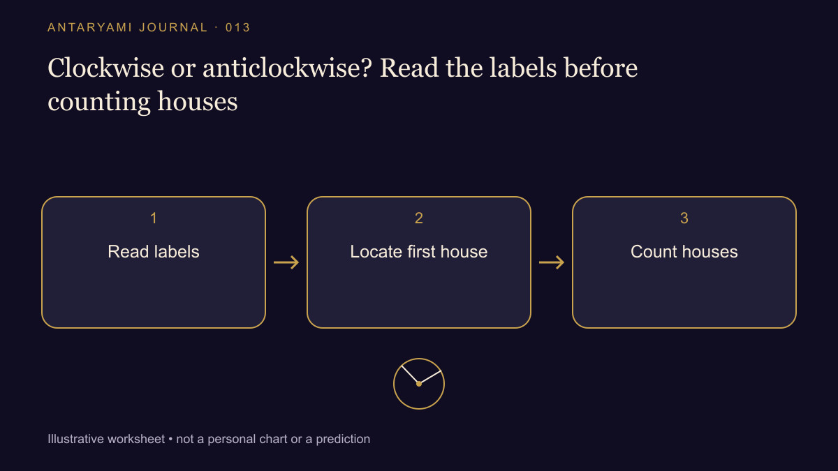
Clockwise or anticlockwise? Read the labels before counting houses
You receive two chart diagrams that appear to count in opposite directions. One has the same planet on the left, while another places it near the bottom. Before concluding that one image is reversed, find out what stays fixed in each drawing. A diagram's layout is a visual convention. The sign, house and degree labels provide the information needed for comparison.
Give the drawings explicit legends
Imagine Diagram A as twelve fixed house boxes with sign labels written inside them. Diagram B is a wheel with sign sectors and a marked Ascendant. These are invented teaching layouts, not a claim that every chart of a named regional style follows one identical design. Their positions on the page are not intended to match box for box.
Choose one fictional planet and write its sign, within-sign degree and assigned house under the declared house method. Find those labels in both diagrams. If they match, the visual position alone does not establish a disagreement. If they do not match, you now have a specific difference to investigate beyond the impression that the whole chart looks wrong.
Read numbers in context
A number inside a chart may identify a sign rather than a house. Another layout may use numbers differently or show both. Do not assume that a printed 2 means second house before reading the legend. Likewise, a symbol's placement inside a box may be adjusted for readability and need not encode an exact degree.
A useful comparison table has separate columns for sign number, house number and angular position. Keeping them apart prevents one convention from being silently substituted for another. If a screenshot removes the legend, ask for the complete chart or the underlying table instead of confidently filling the gap from memory.
Do not repair a layout by editing a profile
Changing a birth time until a chart looks like another image is not a valid way to reconcile different drawing conventions. First check the inputs and settings independently. Then compare the numeric result and finally its visual presentation. That order helps stop a harmless layout difference from corrupting an otherwise useful record.
The same care applies when sharing a diagram with family. Explain which way its labels are read and where the Ascendant is marked. A short annotation can be more helpful than a confident instruction to rotate the phone. Rotation changes the picture's orientation, not the calculation convention that the picture represents.
End with a labelled finding
Your conclusion might be “The drawings use different layouts but show the same sign and house data,” or it might identify one precise unmatched field. Both are more useful than declaring an entire style unreliable because its boxes occupy unfamiliar places. A readable chart gives people a route back to the data; it should not depend on visual familiarity alone.
Astrological interpretations are for reflection, not a diagnosis, a guaranteed prediction or a substitute for professional advice. Journal guides are prepared with AI assistance; they are educational content, not individual consultations.